To illuminate a scene means to bring some elements to the sight and to leave others in the shadow. The appearance of an object however does not depend on the intensity of the light source, but on the contrast between the image and its background. In this article we will speak about the contrasts of luminance.
The Bartleson-Brenemann chart shows how the brightness of the background modifies the perception of the luminosity of the panels (which are on the contrary identical at every line). A dark background shifts all the grey values towards the white compressing the real luminance differences; reversely, a bright background moves all values tending to black emphasizing the real contrast. The situation appears prominent in comparison with a uniform background. What appears in the field of view is thus perceived as a whole of relations where each item takes on a sense in relation to others.

To light a scene means to bring some elements to the sight while leaving others in the shadow. The appearance of a subject however does not depend that much on the intensity of the light source, but rather on the contrast between the image and its background. The eye perceives the shape of the objects if within the field of view an adequate luminous contrast exists between the two objects (or between the object and the background). Only if there is a difference of at least 1% if lighting is on and of 10% if lighting is weak, the eye manages to distinguish clearly what it sees.
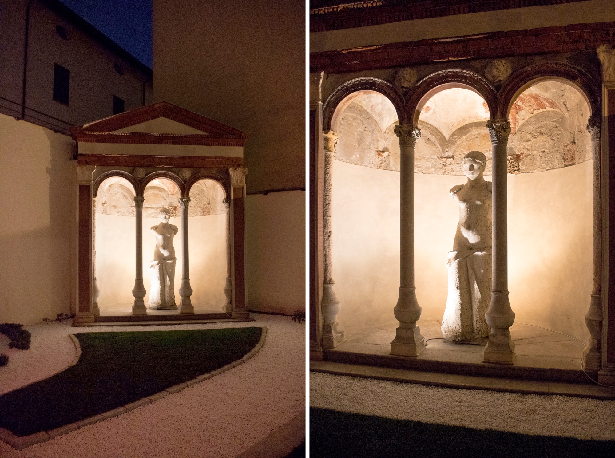
In the case of the small temple shown in the picture, the choice to leave in the shadow the columns and to illuminate the volume at the back allows to clearly catch the shapes and the profiles of the architecture. The volume of the statue breaks away from the background thanks to a play of chiaroscuro that enhances its plasticity.
The contrasts of luminance are the number of luminance gradients within a context and their correct balance is precisely needed to wisely calibrate the quantity of light in such a way as to allow the eye to clearly perceive the important elements composing a scene.
If the differences of luminance within the field of view become excessive the glare phenomenon occurs, causing harm or a reduction of the visual skills. If the difference between the luminances are small, the observer will not perceive the object detached from the background.
For each reference area the GAP contrast must be detected so that the object and the background may be perceived clearly. The formula to calculate the contrast of luminance, in particular, takes into consideration both the object to be illuminated as well as the background:

The optimal value of the contrast yield factor may not be less than 0,7, where 0,85 stands for highly illuminated or 0,10 poorly illuminated. To perceive an object correctly, latter must have a luminance varying between 2 to 3 times the one of the background and between 5 and 10 times the one of the environment. It is of paramount importance to set luminous hierarchies in relation to the focal points of the different scenes by using correctly the contrast of luminance.
The concept used by SIMES
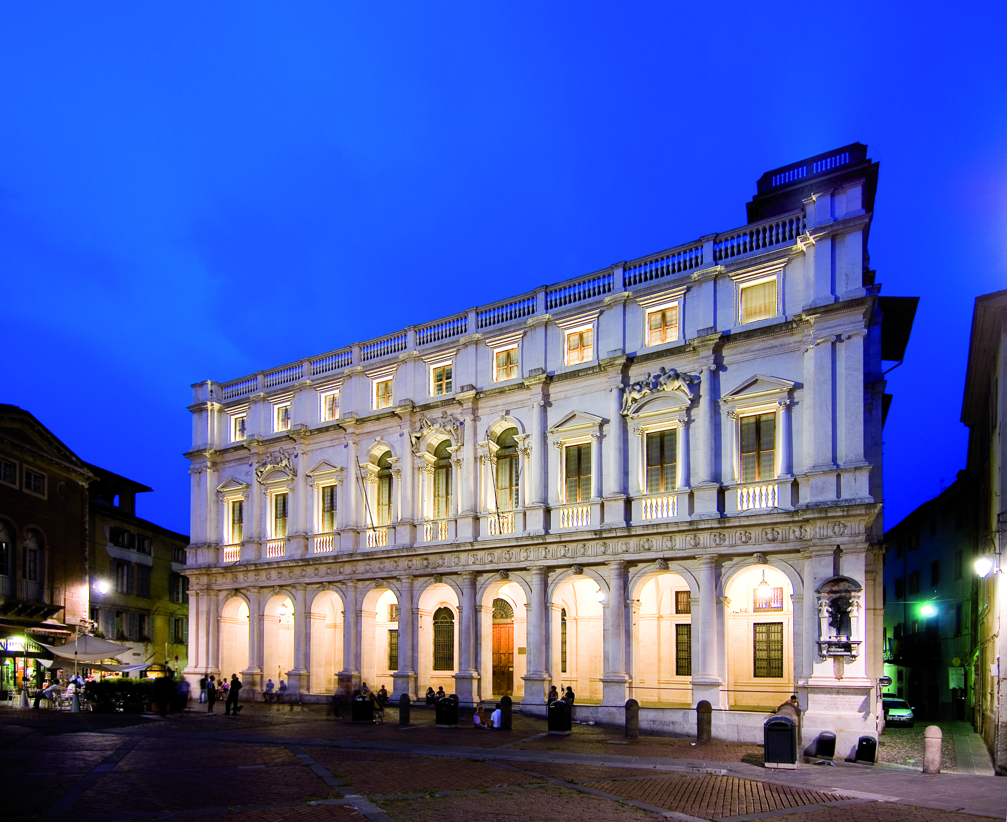
We apply the concept of luminance contrast on this building, historically known as the Civic Library Angelo Mai of the Piazza Vecchia in Città Alta (Bergamo). The library stores up around half a million of volumes and a precious Tasso collection. The main aim has been to emphasize the elegant façade of white marble in neoclassic style, allowing simultaneously the appreciation of the loggia below along with the architectural elements that characterize them.
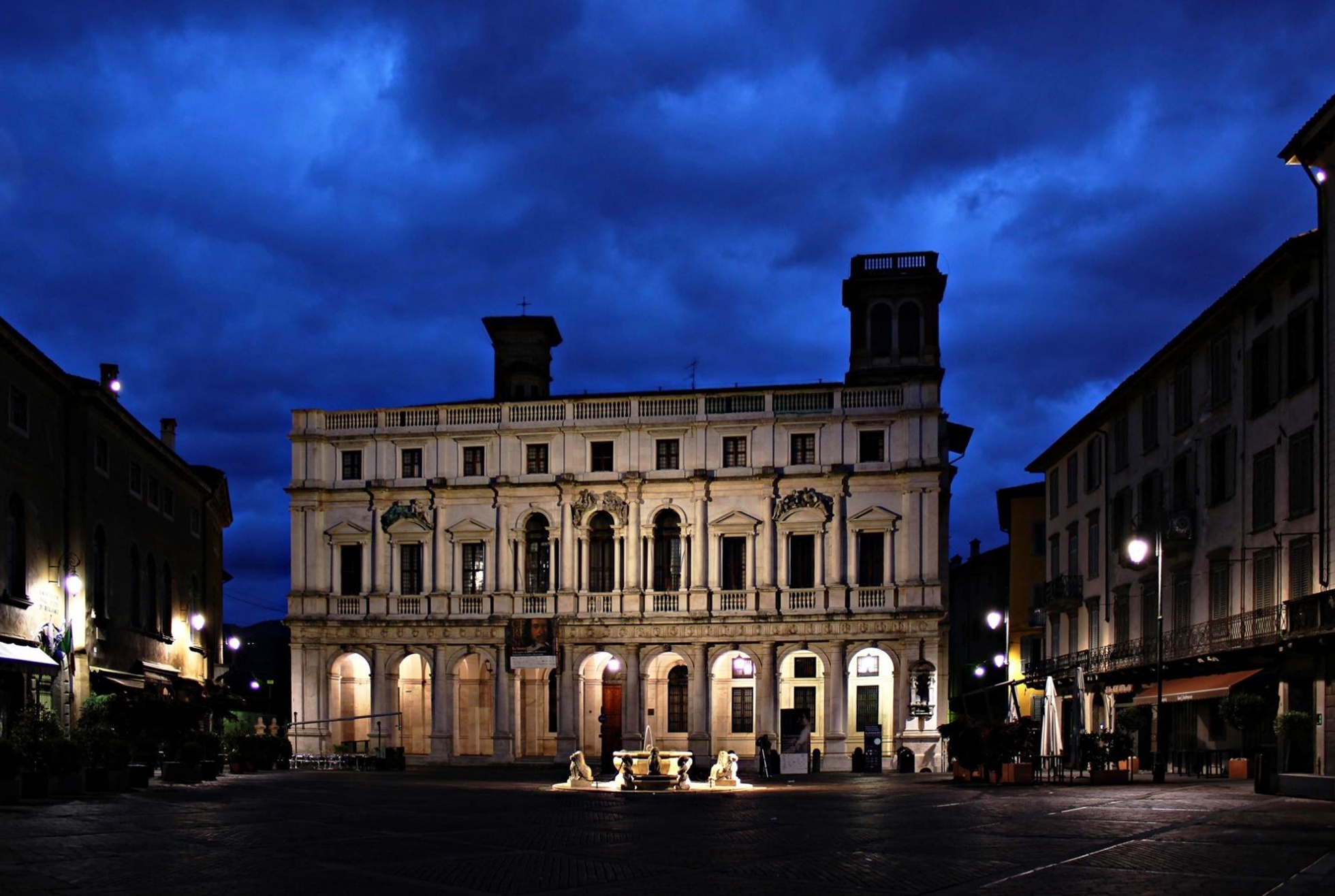
In the original project, only the entrance loggia was illuminated by classic style mercury vapor pendant luminaires, while the whole marble façade was left in complete darkness. The job of SIMES was to entirely redesign the lighting concept of the building as a whole. The concept brought forward has been based upon the contrast of luminance: the lighting designers of SIMES have chosen to illuminate the façade with a veil of light that enhances the purity of the marble texture even at night time.
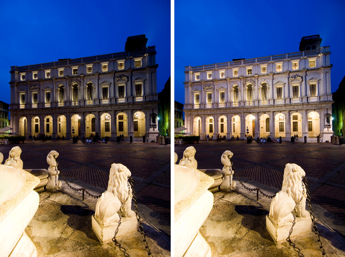
To provide a wide and soft illumination, floodlights were installed on the surrounding buildings. To enhance the architectural elements such as the pilasters and frontons, linear luminaires with a stronger luminous intensity compared to the ones used for the facades have been chosen. The loggia has also been enhanced by choosing light sources with intensities and colour temperature capable of providing a comprehensive luminous balance. The use of different luminance gradients have allowed to enhance the entire façade by highlighting the elements chosen by the lighting designer and to facilitate the appreciation by the observer.
BOOK HERE YOUR ONLINE MEETING!
Fill in the form to receive more information, to share a project and know our newest outdoor collections. We will reply ASAP. You can also book a digital meeting to focus with us on your specific project.